

Microcopy is the short and sweet copy that appears on buttons, labels, forms, and fields on a website. It guides users to the next step, clears up any confusion, and gives a snippet of your brand’s personality.
Because this type of copy is concise and it’s difficult to convey your brand using only a few words, microcopy often goes overlooked. But it’s an important component of your website because it has the power to improve user experience (or scare them away from your website altogether.)
Check out these 3 ways to enhance microcopy on your website and make sure it’s packing a punch:
Recognize where your users need help
Two scenarios where users need a hand are when they forget their password or get hit with an error page.
Users feel frustrated when they receive an error page and may assume it is their fault. If your 404 page uses technical words, users will most likely ‘X’ out of your website – and maybe even head to your competitor’s page.
A helpful error page tells the user how to recover their information and why they got an error in the first place. Try designing a creative error page that speaks to your brand’s personality.
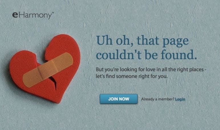
Take a look at eHarmony’s error page. They use microcopy to assure their users that although they landed on an unavailable page, they are in the right place. After this heartwarming message, eHarmony presents users with a clear call-to-action (CTA) that encourages them to sign up for the website or login if they are already a member.
This same dialogue applies to users who forgot their password. It’s best to implement easy-to-understand, short instructions to guide users on what steps they need to take to recover their password. Anticipate how you can help your users by writing copy that answers their questions before they have the opportunity to ask them.
Surprise and delight your users
You can use your microcopy to show off your brand in unexpected ways that surprise and delight your users.
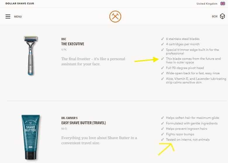
Dollar Shave Club incorporates sarcastic microcopy on their product pages to keep prospective customers on their toes. They say their product is “tested on interns (not animals)” to add a touch of humor and appeal to their manly audience who loves a good Dad joke.
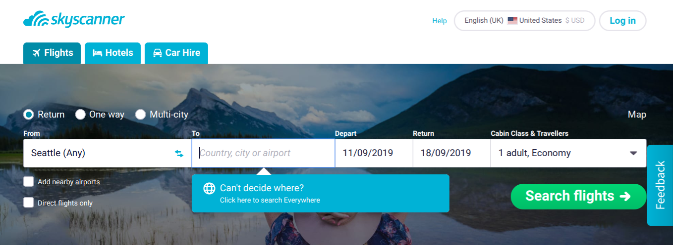
Skyscanner takes a different approach by offering their travel-hungry users the option to search “Everywhere” if they don’t have a specific destination in mind. This simple microcopy leads to users spending more time on their website and inspires them to discover new destinations around the world. Talk about surprising and delighting.
Understand how your users think
To write microcopy that aids users in navigating your website, you need to understand how your users think. For example, if they add a product into their online basket, are they worried about getting charged when they press “check out”? If you think your users are the hesitant type, you might want to add in microcopy that reassures them, “Your card won’t be charged yet” or “You can cancel within 24 hours of placing your order.”
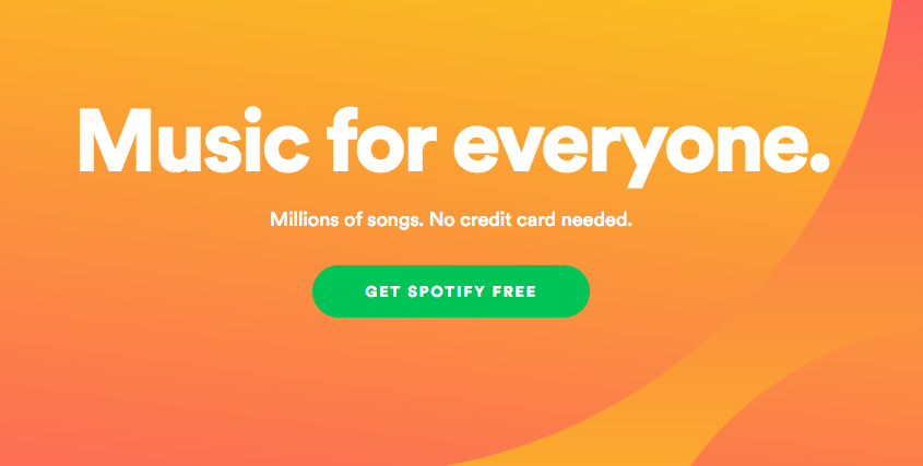
Spotify’s microcopy does a good job of clarifying that the platform is free and their music is available to everyone. This makes users feel secure in moving forward and downloading Spotify because they know they won’t have to pay to use the service.
Slip into your users’ psyches by performing user testing. Ask users’ to think aloud when they are going through your website to see where they are struggling. Listen to the words they use when they are walking through your site and adapt your wording to their plain language. User testing will help you get a better understanding of the questions users have when they are on your website and the type of microcopy you need to implement to resolve their doubts.
How do you use microcopy on your website to enhance user experience? Let us know in the comments!