Publix Super Markets
Website Redesign
Content Strategy & Development
Everyone knows that Publix is the supermarket “Where shopping is a pleasure.” Publix needed a site (with great content) that lived up to this promise.
We were able to take the quality of content on Publix.com up a few notches by unifying departments and stakeholders around a consumer-centric strategy and voice.
- Content Audit & Roadmapping
- Information Architecture
- Workflow/Process Development
- Platform Migration
- Copy Development
- SEO


Core content was reorganized and re-written to eliminate internal jargon, encourage conversion, and marry the brand promise to the site experience.
We oversaw content development for campaign and program pages to make them more consumer-centric, and more enticing.
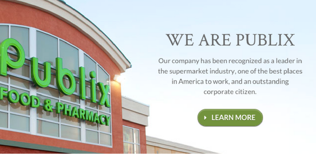
We re-thought and rewrote the Publix corporate site to appeal more to key audiences: potential recruits, investors, and the media.
Departmental content was revamped to show off key differentiating qualities, and appeal strongly to the end consumer.
